Often, there is no “right” way to accomplish something in Tableau. There are often many ways to approach a solution. Sometimes there are “better” ways.
I’ve been thinking for a while about a couple of my earliest posts (Dynamic Annotations part 1 and part 2). It occurred to me that I had very much over-complicated the solution. The more I understand how Tableau works, the simpler some things become. It can be fun to struggle and come up with unique and creative solutions but it can be equally satisfying to understand why things work and have clarity on how to achieve certain results.
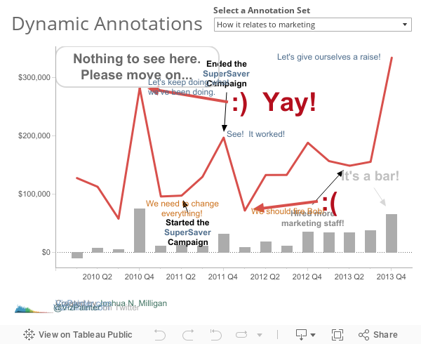
Dynamic Annotations is one such case. Here is the easy way:
I had previously realized that a mark annotation was associated with a mark and would only show if the mark was shown. My solution to turn annotations on or off was to show or hide certain marks using various calculated measures and dual axes. Whoa! Way too complicated…
What defines a mark? When you see a bar or a circle or shape in Tableau or when you see the text “17 marks” in the lower left status bar, what is it that define those marks?
Tableau draws a mark for every intersection (tuple) of dimension values.

Various other factors can come into play.
Data densification can complete domains of dimensions and cause more marks to be drawn:

Multiple axes can duplicate marks (once for each axis):

Mark annotations are applied on a mark. But what defines whether a specific mark annotation is shown is not just the intersection of dimension values. There are two major factors:
- The placement and order of any fields on the Rows or Columns shelf (the fields that define the X and Y position of the mark)
- Any field used as a dimension on the Marks card or Pages shelf (fields that add additional values to the dimensional intersection / tuple).
The distinct combination of values for those fields defines a unique mark annotation which will only be shown for that specific set of values.
All of that may seem rather complex — but it leads to a very easy way to create dynamic annotations in Tableau. You can have sets of annotations controlled by parameters or include fields as dimensions on the marks card that will change values based on action filters in a dashboard. The possibilities are endless for dynamically controlling which annotations are shown.
Here’s how I created the sets of annotations shown above: First, I created a parameter that allows the user to decide which set of annotations to see. You’ll notice I used a list of integers with “Display As” text.

Then, I created a calculated field that simply returns the selected value of the parameter.

Then, I just placed that calculated field on the Marks card as a dimension (remember, that is one of the key factors). Then, as I cycle through the parameter options I can annotate marks with whatever annotations I want to have displayed for that particular selection of the parameter.

Wow! That was far easier.


Pure sweetness. Nice work, Joshua. Thanks for sharing. I will use this technique.
Thank you Ken! I’ve used similar techniques a little bit in the past (see the Greek New Testament dashboard) but that was all through trial and error. Now that I understand how they are working I’m excited to think of creative new uses.
I would not have thought to have done it this way and I love it. Thanks for sharing an easy and very useful technique.
Thanks Steve!
Wow, great tip. Your comment inspired me to try something.
I was able to place months on the page shelf, move the pages to the end, then mark-annotate the months in question. When I jumped back to the beginning my annotations disappeared. As incremented through time ‘poof’ my annotations suddenly appeared.
Actually in some ways, it was like a more flexible Story Points feature! Or at least combine this with story points to add more “steps” to one story point.
Very cool!
I think you bring up some good points. There is some additional flexibility with parameters, especially when you consider how you might use them to use sheet swapping or update calculated fields that update the display of color, etc… The trade-off, in many cases, is that story points take fewer steps to implement — and gives you the ability to switch to entirely different dashboards.
Fantastic mate, you promised a new blog entry in the near future and have delivered. Very much appreciated!
Thanks for the encouragement!
Very cool. I was actually looking into a javascript approach to adding an overlay “guide” into my dashboards. This would be a much better approach since I could manage the content within the worksheets and use an existing control to toggle the overlay.
Excellent advice. Thanks for sharing!
You’re welcome! Thank you for the feedback!
Hi Josh,
What happens when you have 10’s and possible 100’s of different marks that you want annotated based off of the user’s selection in a filter? In our example we may have a list of physicians in our filter or parameter selector. When a user selects physician 1 out of 100 they want to see that physicians annotation on the scatterplot. Is it possible to do this dynamically or does it only work for small lists with manual entry of each annotation?
Thanks!
Chris
The approach I suggested in the post is well suited for a small number of marks, because it will be a manual process. You can use labels and clicking on the Label shelf reveals options for showing only when a mark is highlighted. Also, you can use calculated fields on Label that change value dynamically based on parameter selections. Hope that helps!
This is the definition of an ‘elegant solution’!
Nice play!
Why the parameter has to be integer? String doesn’ t work.
Great tip…thanks a lot for sharing!!!
This is great! The challenge I’m facing is a bit different. My annotations should change based on two Dimensions at the same time: Indicator and Geography. I’m wondering what a calculated field should look like that to capture both dimensions (and be used to create dynamic annotations).
I think you could simply create a calculated field to concatenate the two values together to give you a unique identifier for both dimensions. Something like:
I love this! Is there a way to do something similar for Area annotations as opposed to marks?
I can’t think of a good way. The mark annotations are dependent on the dimensions that make the mark, but area annotations are simply shown or not based on whether they fit in the view. If I think of something, I’ll post it!
Hi Joshua,
This is brilliant stuff.
I use cubes as source, not possible for this solution to work with cubes right,because of the fact that I cannot convert a measure into a dimension in a cube?
Kindly do let me know your inputs.
Thanks,
Nick.
I downloaded your workbook but still could not figure out how you did it. I added an annotation to the chart and it stayed there regardless of the parameter selection.
I appreciate your help.
Thank you
Thanks Josh, this works great! So well, in fact, that after I used the technique to dynamically label specific zip codes on an already busy dual-axis map I was asked to do the same for several maps. 🙂
I appreciate the clear explanation and clever thinking!
Thank you!
For everyone else who has realized that this awesome technique no longer works as of v2019.1, Chris Love addresses the problem in this blog post, and provides a calc adjustment to get you back in business: https://www.theinformationlab.co.uk/2019/07/02/adding-a-guided-tutorial-to-your-tableau-visualisation/.
If you implemented this method before v2019.1 and haven’t checked in on those dashboards since upgrading, you should. ALL my annotations were showing at once – argh!
Thank you Jen!
Have you gotten the new method to work? He doesn’t describe it very well and it won’t work for me.
Thanks Josh – this is a really powerful addition.
I am now wanting 1 more level of annotation that can be turned on/off but will display regardless of what points are kept in the chart (i.e. area annotation that can be turned on/off). Is there anyway to make a mark that stays in the chart regardless of filter selection?
Hi, thanks a lot for sharing – looks very nice.
I’m very new to tableau, and I don’t get this one done:
Then, I just placed that calculated field on the Marks card as a dimension
-> how can I add a calc field as a dimension
Sorry, if this is a trivial thing…
Hi, thanks for the great tutorial! This works really well for me on Tableau desktop, but once I upload the vis to Tableay Public, it doesn’t work anymore (notations always showing).
Any ideas why?
Lisa