Tableau 10.2 is almost here! And it’s time to celebrate!
One thing I’ve always wanted to do in Tableau is create interactive historical maps that changed based on the selected time-frame. We are fairly familiar with the shape of things now – countries, states, counties – but how did things look in the past? What was the shape of the Roman empire? Or the Greek, Persian, or Babylonian territories before that? How did Europe change over the last century?

While this could have been done before, Tableau 10.2 (coming soon!) made it incredibly easy with its ability to connect to spatial files. I’m planning a post covering technical details of how I worked with spatial/shape files in Tableau and other new Tableau features such as union updates (and a cross-database union hack – update: Jonathan Drummey beat me to it!) and more! (In the meantime, check out Kent Marten’s post about geospatial analysis in Tableau 10.2)
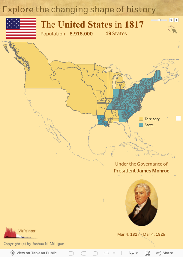
But back to fun with shape files: Below you’ll find an interactive historical map that allows you to see all the states, counties, and territories in the United States at any given point in history from 1630 to 2000. Here are some notes and sources for the data:
- The historical shape files come from the Newberry Library.
- Images of flags and English/British rulers come from Wikipedia listed under creative commons.
- US Flags prior to 1912 did not have an official pattern of stars
- I found images of the presidents in Zak Gorman’s Tableau Public Wheel of Presidents
- Population data comes from Wikipedia which listed values for every decade. In-between years are filled in with approximate values based on linear growth for the decade. This source notes that census counts did not include Native Americans until 1860.
- The states, counties, and territories are shown with borders as of July 4th for the selected year.
And now, have some fun as you explore the changing shape of history: