Welcome!
I started blogging here in May 2014 to share Tableau tips and tricks. Things have really taken off since then! I continue to share tips and tricks and I still focus heavily on Tableau – the tool that allows me to have a seamless conversation with data, draw insight, ask questions, and get answers that sometimes initiate action and sometimes deeper questions.
Along the way I’ll also share some broader dataviz lessons and maybe a story or two – possibly some data storytelling and even some stories of my journey in the world of data and data visualization.
Best Regards,
Joshua Milligan
Here’s what I have to share…
![]()
You can't beat the convenience of online grocery shopping. Especially with four young children, I find it wonderful to pull
The very first blog post I ever wrote demonstrated how to calculate distance between locations using a parameter and table
It's here! The fully playable Tableau Minesweeper Game. Designed in pure Tableau... no JavaScript, no API, no extensions, no R
When I was young I used to watch reruns of the original Star Trek. But I didn't know they were
Last year, I went home from the Teknion Christmas party with a shiny, new Nest Learning Thermostat. Sure, I was
Dynamic Parameters in Tableau is one of the most requested features of all time. Tableau's developers have tackled individual use
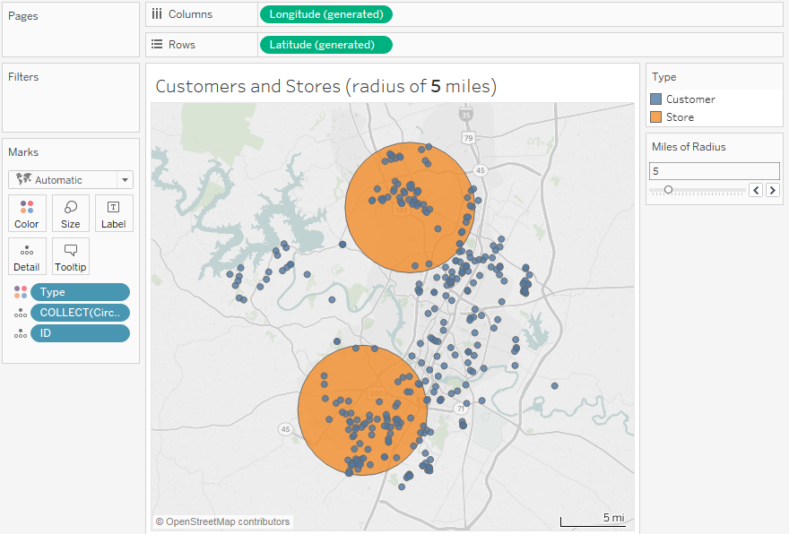
How can you join your non-spatial data to spatial data? Using the latest spatial functions, you can achieve spatial joins
I wrote previously about some very simple, but useful, Python scripts for Tableau Prep (and start with that post to
Tableau Prep Builder 2019.3 is currently in beta and I'm loving it! (along with all the other goodies: Tableau Desktop,
Tableau 2019.2 is currently in its second beta* which means it is getting closer and closer to release! And I'm
I personally use Mint to track my personal finances (I'm not officially endorsing, but it does help me get the
Recently I gave a "State of the Unions" address for Tableau's Think Data Thursday (the recording is here) in which
I am so excited to head to NOLA for #TC18! Tableau always puts on an amazing conference and I cannot
I've been hearing about DataRobot for a while now (in fact, Teknion Data Solutions, where I’ve been a consultant for
One thing I've submitted an idea for Tableau Prep (and would love if you voted for it!) is the ability
How can you leverage SQL Server geospatial tools in Tableau to draw cool curved flight paths (or any great arcs)?
How to handle new input files in Tableau Prep Let's say you've got a situation where you get new input
One of the questions that comes up quite often is "How do I remove duplicate records in Tableau Prep?" or
Tableau 2018.1 introduces a lot of new features, especially geospatial features that open a whole new world of data exploration
You know you have a great piece of software when you can use its paradigm to come up with workarounds
Cross database joins have been available in Tableau for a while now - and I love the ability to join
I recently had the privilege of presenting a preview of Tableau's Project Maestro (now known as Tableau Prep) to the
Often, you’ll have data that looks something like this: Every day, there are new records for projects that give
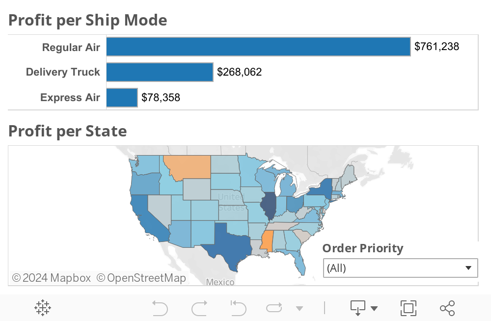
I love hex maps! Especially for the United States, you can keep states in a basic geographic orientation, but eliminate
Tableau's new data prep tool, Maestro, is now in public beta, and I'm loving it! While the first beta doesn't
I used to think you couldn’t hot-swap geographic levels of detail in a Tableau visualization. And, before Tableau 10,
I recently competed in the Tableau Iron Viz where Tristian Guillevin, Jacob Olsufka and I raced to build a dashboard
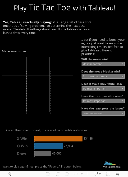
Ah, games and Tableau - two of my favorite things together! And it isn't all just about fun and games, it's about
I was part of a conversation recently where something like this was said: “We need a data model that will
I recently came across this post by Simona Loffredo in which she describes a certain type of data structure, why
Wow! I'm still stunned to have won the first IronViz feeder contest for 2017! And excited! And humbled. And honored.
I previously shared the fun I had with Tableau 10.2's ability to connect to spatial files. In that case, I used historic
Recently, I gave a presentation on storytelling with data visualization. I described the elements of a story, how to leverage
Stories are powerful. They connect an audience with people, facts, emotions and action. They help us understand difficult concepts and
The Tableau technique shown here is to use an action to update an entire dashboard, including the filter selection and
Tableau 10.2 is almost here! And it's time to celebrate! One thing I've always wanted to do in Tableau is
Happy New Year! Even as 2016 was winding down, I found myself with a challenge dealing with time. And I
Tableau Conference 2016 is over and I'm still digesting everything I saw, giddy with excitement over the new features that were
So, I previously wrote about how to use data blending to get data from multiple Google Analytics data sources into
I really love the Tableau Community Forums. If you haven't ever experienced the forums, you really should! It's a vibrant community all
Have you noticed my blogging frequency has been down in the last few months? Have you missed me on Twitter?
Learn Tableau: something new every day! Years ago, one of my colleagues asked if Tableau was something that you could
Tableau 10 is on the fourth beta, which means the Tableau devs are getting really close to production release (as far
I've been blogging about some of the "little" Tableau 10.0 new features that aren't as publicized as some of the
Big shiny new Tableau 10 features get all the press: Data Highlighter, Custom Territories, Cross database joins... But what about the
As I've been beta testing Tableau 10.0 and working on a new edition of Learning Tableau, I've been making all
Ever design a table in Tableau and wish you could insert a gap between columns or rows? Maybe you want
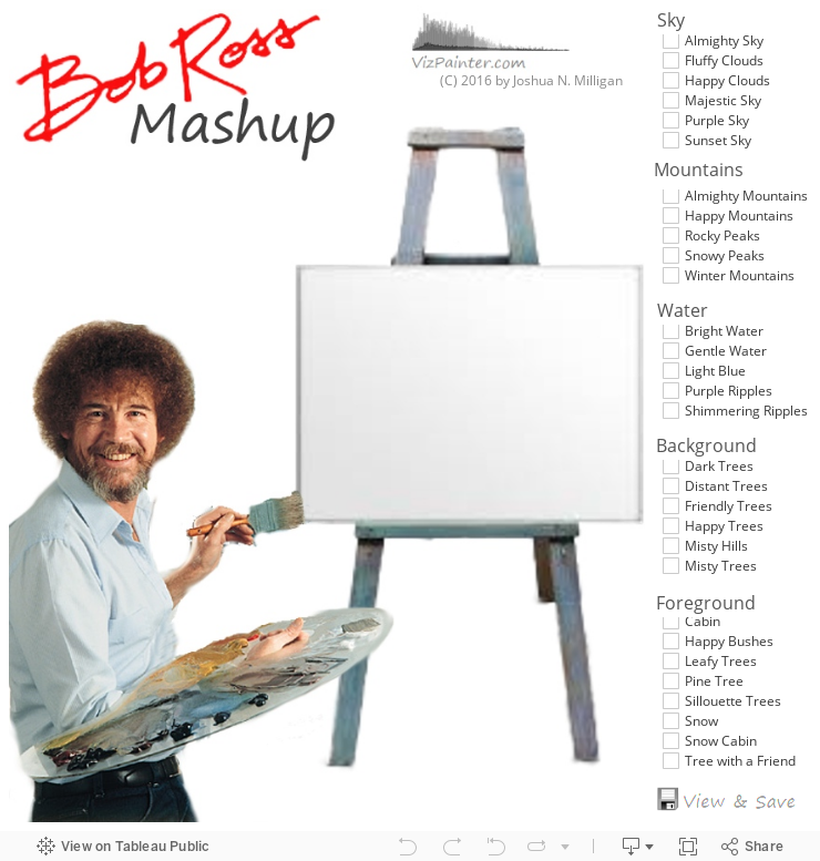
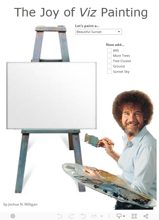
I grew up watching Bob Ross and as I watched him mix colors and beat brushes, I knew that I could
Finding the Data Story Who doesn’t love politics? The latest in the round of IronViz feeders from Tableau features this
Summer has come in Texas! School is out. Tableau 10 beta testing is going full steam ahead and the new
You may recall a previous post in which I warned of some landmines in using Excel with Tableau. Well, looks like
Having never previously entered into the Tableau #IronViz feeder contests, I was eager to participate this year. The category of
Excel spreadsheets and flat text files can be incredible data sources for Tableau. They are ubiquitous, easy to use, easy
On March 24, at noon CDT, I'll be presenting a webinar that looks at the fun and serious sides of
#TableauIsWhy I see the underlying data that matters most... The dashboard I had been using Tableau for a few years
I've been participating the beta testing of Tableau 9.3 and I’m loving the innovation the Tableau developers have been bringing
In a previous post I shared how even a small tweak to a dataviz can change the perspective of the
Is there a single best visualization for a given set of data? Should you always use a bar chart when
The Problem of Partial Periods So you built out that incredible Tableau* time series viz showing sales per week or
A long time ago in a galaxy far far away Wow! Star Wars and Tableau. You can't get much
The Assignment When I was in junior high, my math teacher, Mrs. White gave the class an amazing assignment. She
I recently tweeted that Box and Whisker plots have never been my go to DataViz type. I don’t know
You may not think of Tableau as a game engine, but I've used it to create interactive games (such as tic-tac-toe,
It's time for the Tableau Conference! (a.k.a. #data15 or TC15) If you are going, I look forward to seeing you
At some point, I got labeled as a “Tableau cube expert.” The funny thing is, when I first acquired this
Navigation buttons can make a series of dashboards easier to use. The most common approach has been using a view
“I need you to reproduce this report,” your boss states as he hands you a printout. “And you can use
Recently, I was helping someone with a Tableau dashboard in which an action from the first view filtered a second
In the 1980s, my dad brought home a Tandy 1000. I still remember him giving instructions to my mom and
Ad-hoc calculations are new in Tableau 9.0. They’re quite useful. And they are fun! There’s so much you can do
I’ve been following with great interest the discussion in the Tableau community surrounding various approaches to using Level of Detail
A few years ago, a colleague of mine sent out an email asking if anyone was interested in serving as
Over the next few weeks, leading up to the Tableau Think Data Thursday presentation (register now!), I'll take a look
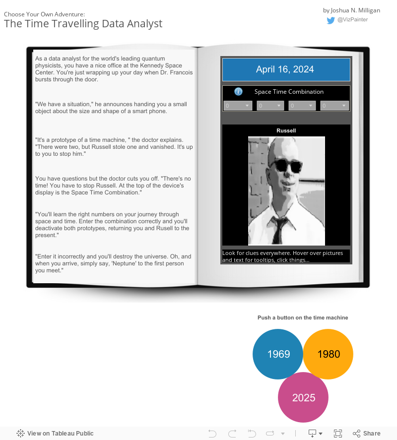
The wait is over! The game is now online! You've seen Choose Your Own Adventure, Tic Tac Tableau, and
Actually, it’s not dates in Tableau. Tableau does wonders with dates! What other tool allows you to connect to
Today's Tableau Tip comes from my colleague, David Baldwin. I am privilleged to work with him at Teknion Data Solutions, a
Wouldn't it be great if there was a way to hide something on a Tableau Dashboard? Something you, the designer
The Tableau 9 Data Interpreter and other new data prep options, such as pivot and split, open up new possibilities for
Previously, we saw how to capture and use Tableau's automatically generated latitude and longitude for custom geocoding. Now, we'll extend
Last time we looked at a simple way to implement custom geocoding in Tableau using the ability to assign
Sometimes you want to customize titles or even hide titles in Tableau. When shown on a dashboard, titles will always appear,
Tableau has outstanding built-in geocoding capabilities. If you have countries, states, zip codes, congressional districts, statistical areas, etc… in
I recently blogged about my favorite Tableau 9.0 feature: LOD Calculations. This feature really blows open the possibilities for analysis
Last night I upgraded a Tableau Server for one of our clients1. They weren't ready to go to 8.3 yet
Tableau 9.0 has moved from alpha to beta and I'm loving it! There are many new features to enjoy: Improved calculation
No, not really! I love table calculations! They are powerful and very useful. They are one of the best things
If you are using Tableau for data analysis, there is one question you really should answer for any data source before
I recently came across this post that highlights the importance of seeing what isn’t in the data: http://blogs.hbr.org/2014/05/visualizing-zero-how-to-show-something-with-nothing/ In Tableau,
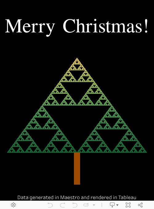
I love getting Christmas cards! But sending them can be a chore1. Fortunately, there is Tableau, a sophisticated-yet-intuitive-to-use rapid data
Often, there is no "right" way to accomplish something in Tableau. There are often many ways to approach a solution.
First, I need to say I have the best co-workers. They are colleagues and friends. This was on my desk
Can't wait for the Tableau conference next week year? How about playing a game of blackjack against Tableau in the
I love history, but I find it difficult to remember all the details. That's mostly the way it's taught and
If you missed them, see the original Tic Tac Toe Dashboard and Part 1 first. Chris Love asked if it
Once I had the idea of creating a dashboard to play Tic Tac Toe against Tableau, I had to come
Ever since Noah Salvaterra raised the possibility that Tableau could become self aware, I've been unable to sleep. The thought
I used to read Choose Your Own Adventure books when I was a child and I always wanted to write
Wow! Tableau Tips Month is almost over and I almost missed it! (Or maybe I was just early with this
By day, I design Tableau dashboards for clients. This means I'm often creating financial dashboards (some of these are mine),
What's the difference between the two bar views below? Both bar graphs were created relatively easily in Tableau.
The term redshirt has come to mean any stock character who is introduced in an episode only to be killed
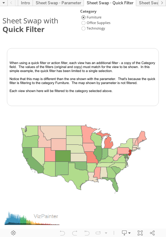
Sheet swapping or sheet selection is a technique used to switch out views in a dashboard. The basics approach for
Update: These options are good if you are using Tableau 8.3 or earlier. But if you're using 9.0 or later,
I recently submitted a couple of 3 minute win entries (I should have blogged about it - wow I'm behind!)
I was asked recently to do a small research project recently into why Tableau wasn’t recognizing certain MSAs (metropolitan statistical
(This is one of the most popular blog posts here... but it was written when Cuban cigars were still under
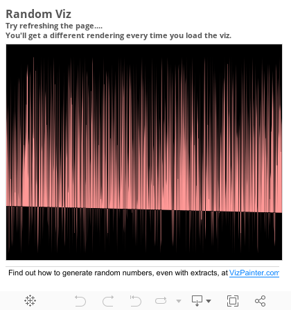
Ever wish you could use random numbers in Tableau? Of course, when you are connected to a data source
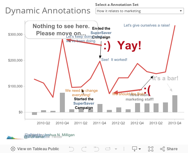
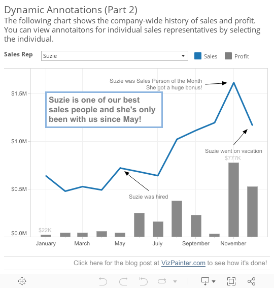
Edit - This post describes one approach. But, it turns out, there is an easier way: Dynamic Annotations (Part 3)
Edit - This post describes one approach. But, it turns out, there is an easier way: Dynamic Annotations (Part 3)
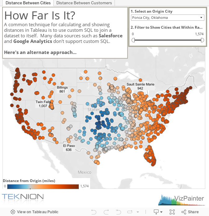
The Issue A common technique for calculating distances in Tableau is to use a custom SQL statement to join a


Hello Joshua,
I was at the User Group where you did the demo Games in Tableau at Teknion. Towards the end, you show a dashboard of Rep sales, I believe, with links to another dashboard. I remember you mentioning that you will have that on your website, but I cannot find it. Can I download it? If so, would you be able to send me a link to that dashboard?
Thanks,
Kary Tran
Kary,
Thanks for the comments! Although not obvious, the dashboard is actually part of the Demo workbook available via the “Download Workbook” link in this post: https://vizpainter-sk6s3zhrnq.live-website.com/games-in-tableau-pushing-the-limits-with-practical-results/
Sir,
This site is full of useful tips and thanking for the same. I want to learn more about the chart types that are appropriate in a storyboard. if there is any writeup here, please lead me to that.
Thanks
–Rangarajan
Hi All,
My question is around, how can we set/change the default shape directory.
I am currently working on to set an org structure for a company. The scenario is that people keep joining the company and I want Tableau to pick a default image in the org structure instead of default available shapes (circle, square, plus, etc).
You can see the snapshot of the dashboard, where I do not have the image for resource3 and Tableau picked + automatically. P.S.: the above snapshot is sanitized and I used gender icons for the image instead.
Please help me figure out either, how to add an image as default in the default folder and location of the default folder? or how can I set a different folder as default?
Hello Joshua,
I have been following your posts and YouTube videos and I have learned a lot from them. I have also searched the web and not found a way to show conflicting dates in a Gantt Chart.
For instance, I am trying to visualize a set of projects in a Gantt chart and highlight conflicting dates. Below is a link to a similar question that was asked on the Tableau website:
https://community.tableau.com/thread/156106
If there any way to achieve this using Tableau 9?
I would appreciate any assistance. Thanks for the good work you do.
Great question! Let me give this some thought and I’ll get back to you (or maybe even write up a blog post!)
I ran across the photo of the men with the Unions Make Us Strong sign on Facebook. The man in the white fedora looks exactly like my father. Do you have any knowledge of when and where this photo was taken or where I could find additional information about it? Thank you.
Jeanne,
That’s fascinating! The image itself came from a Google search and I remember reversing it (you can see the sign in the background says “Paint” but is a mirror image) and I replaced the text in the sign the man was holding. I don’t recall what the original text said. I’ve tried finding the original image by searching terms I might have used and also searching by image (the way it is and reversed back to the way it would have been) but cannot locate it right off. I also don’t seem to have the original image anywhere. If I do find anything or suddenly recall what I might have searched I’ll let you know!
looks like there is an error on your vizpainter.com page
this is appearing at the top
Warning: include_once(/home/vizpaint/public_html/wp-content/plugins/wp-super-cache/wp-cache-phase1.php): failed to open stream: No such file or directory in /home/vizpaint/public_html/wp-content/advanced-cache.php on line 22
Warning: include_once(): Failed opening ‘/home/vizpaint/public_html/wp-content/plugins/wp-super-cache/wp-cache-phase1.php’ for inclusion (include_path=’.:/usr/local/php71/pear’) in /home/vizpaint/public_html/wp-content/advanced-cache.php on line 22
Thanks! I think it’s resolved now